COVERAGE REPORT • JOSTENS
Making every student
easier to see — and harder
to overlook.
Synthesized years of customer feedback and research to redesign a decade-old experience, helping teams spot representation gaps, act on the right data, and build a more inclusive yearbook experience.
8 weeks from pilot to broad launch
Role
Lead product manager • UX strategy
Product
Coverage Report · B2B student data management experience within Yearbook Avenue
Stage
Legacy redesign → Pilot → Full release
Timeline
Spring 2025 to Summer 2026 • Ongoing evolution
What I owned
Product strategy • Product discovery and stakeholder research • Roadmap and prioritization • UX direction • Requirements and acceptance criteria • Pilot scope • UAT and launch
Team
Product and engineering • Sales, marketing and customer support • Operations and IT • External design partner
THE CHALLENGE
A legacy tool had to become the command center for more inclusivity.
Critical, but difficult to read. The Coverage Report held the information staffs relied on to understand who was represented in their yearbook—along with portraits, sales and student data—but its spreadsheet-like experience made important signals difficult to find and act on.
Coverage was becoming bigger than the printed book. Our product vision was expanding inclusion through consumer products, giving students and their communities more ways to contribute and be represented. This product needed to evolve to help staffs understand representation across both the physical yearbook and Yearbook+ digital experience.
Modernize without losing the workflow. The challenge was to translate a nearly decade-old, data-heavy product into our new design system—making coverage more visual and actionable while preserving the depth experienced users depended on.
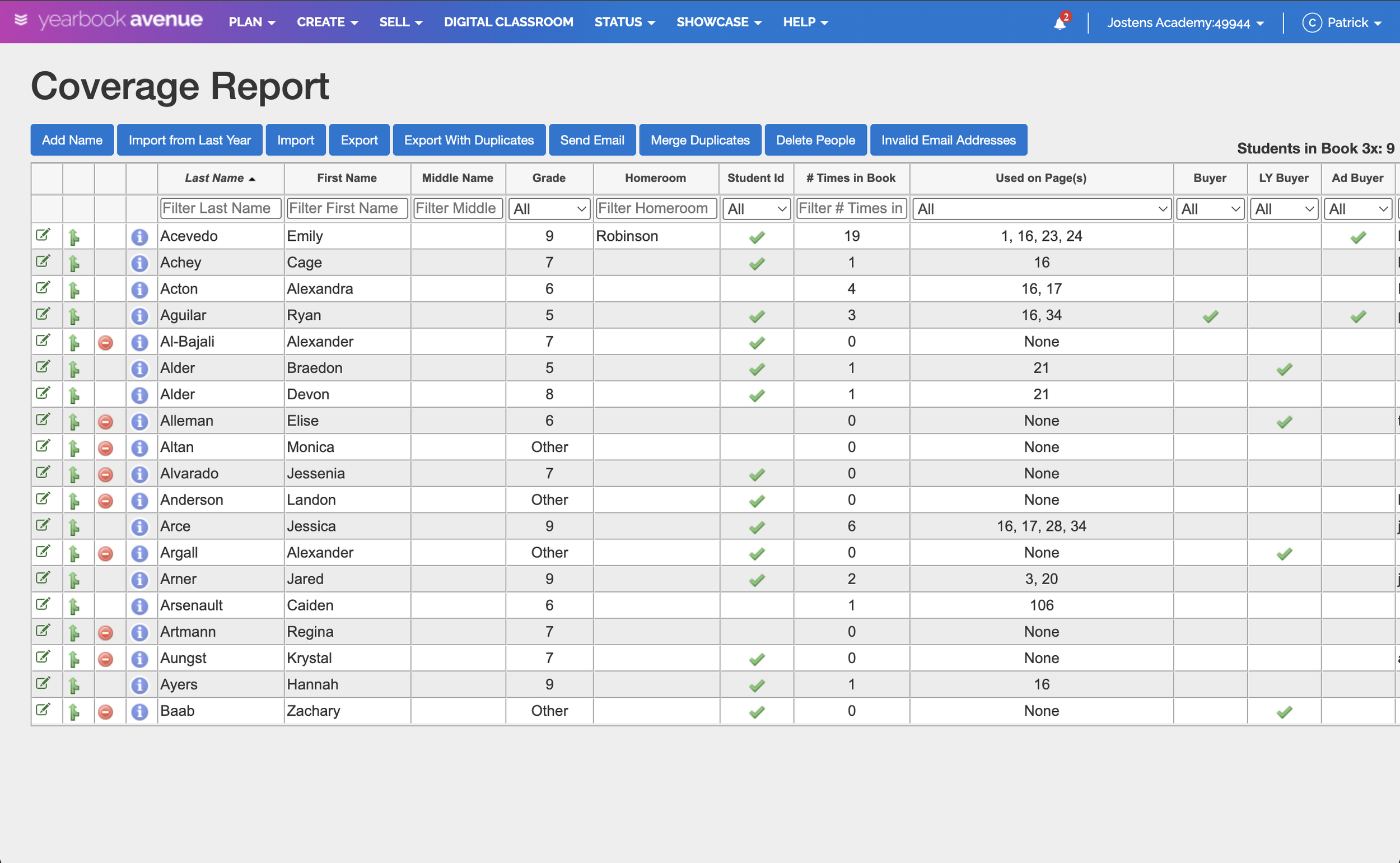
The legacy Coverage Report experience.
WHAT WE LEARNED
The spreadsheet was only the surface.
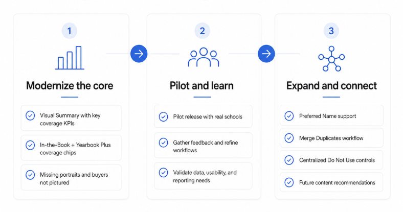
Years of feedback pointed to the same friction. I combined historical feedback with in-depth user interviews, finding Users wanted critical coverage signals surfaced faster, simpler sorting and filtering, and an experience that felt far less like working in a spreadsheet.
The data couldn’t simply be redesigned. Highly protected student information already flowed across multiple experiences and from one school year to the next. Changing fields or structures could create downstream consequences, so modernization had to work within—and carefully evolve—those dependencies.
Data quality was part of the user experience. Inconsistent required fields, unreliable imports and duplicate records could make student coverage and sales information inaccurate.
Familiar doesn’t always mean good—but it still matters. Users had built years of habits around the legacy experience, so the redesign needed to feel meaningfully better without feeling foreign—and would require thoughtful rollout, education and training.
THE STRATEGY
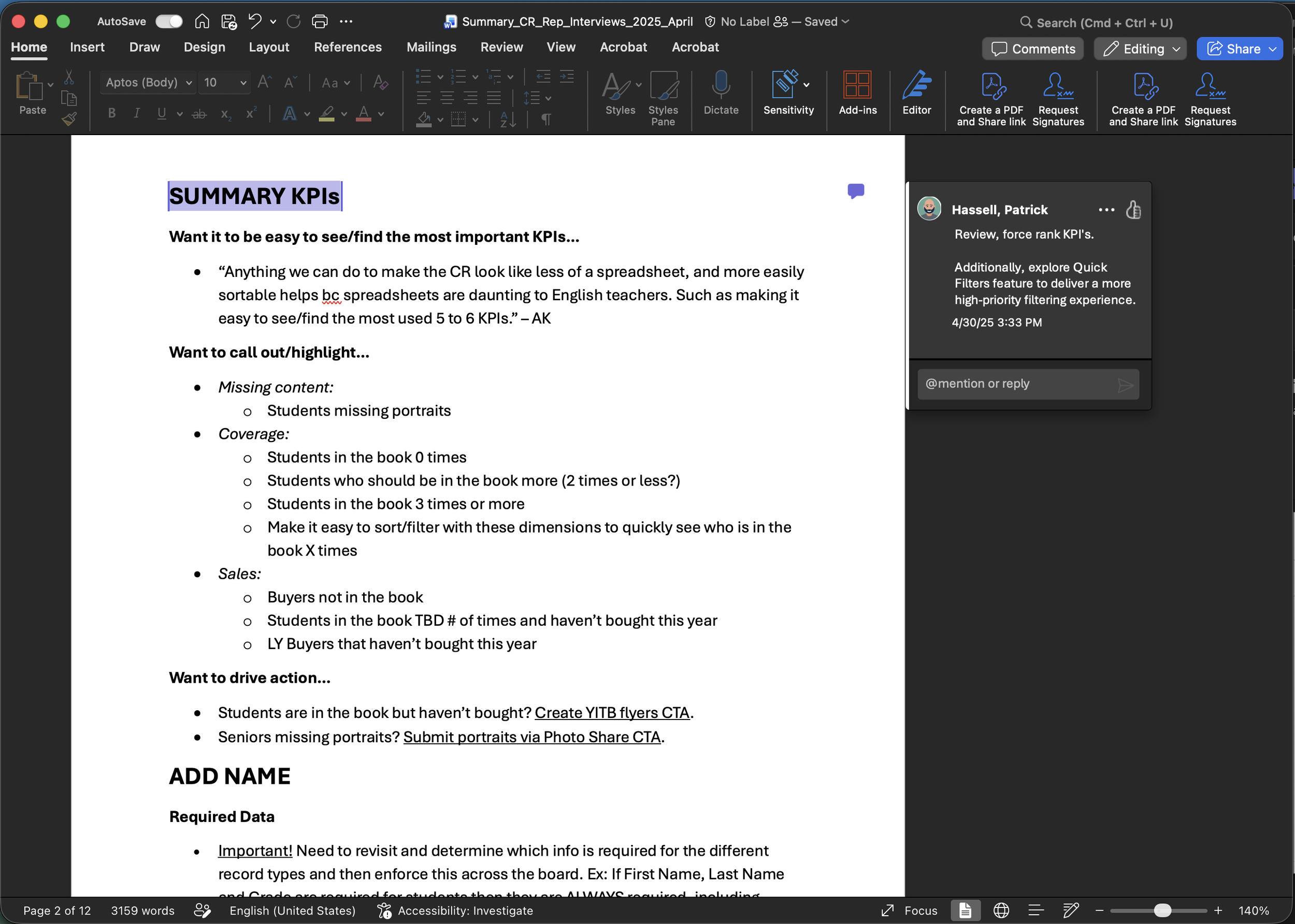
Modernize the core.
Protect the system.
Learn in market.
Organize the experience around inclusion. We centered the redesign on the questions staffs needed to answer: Who is missing? Who needs more coverage? Who has reached the 3x coverage goal?
Evolve the experience without breaking the ecosystem. We used the new design system to create a more visual, intuitive product while respecting existing student-data structures and downstream dependencies.
Separate the essential from the eventual. We defined the pilot around the core reporting, filtering and record-management experience, while intentionally carrying forward or deferring capabilities that needed more work.
Use rollout as part of product development. Rather than wait for every roadmap item, we planned to get the redesigned experience into customers’ hands, learn where there was friction and continue improving it through the broader launch and subsequent releases.
THE EXPERIENCE
Turn rows of data into answers.
Put inclusion at the top. A new visual summary surfaced what staffs cared about most with filterable key metrics.
Show the whole coverage story at a glance. We redesigned the table around information users needed to compare quickly, including separate coverage indicators for the printed yearbook and Yearbook+. Users could sort by either and drill into a student’s coverage to see tagged photos and where they appeared in the book.
Design around the record, not one generic form. Students, faculty and organizations became distinct views with information appropriate to each.
Keep the power, reduce the friction. Search, filters, sortable and resizable columns, inline editing and a mobile-optimized record experience made a data-heavy tool more flexible without stripping away the depth experienced users relied on.
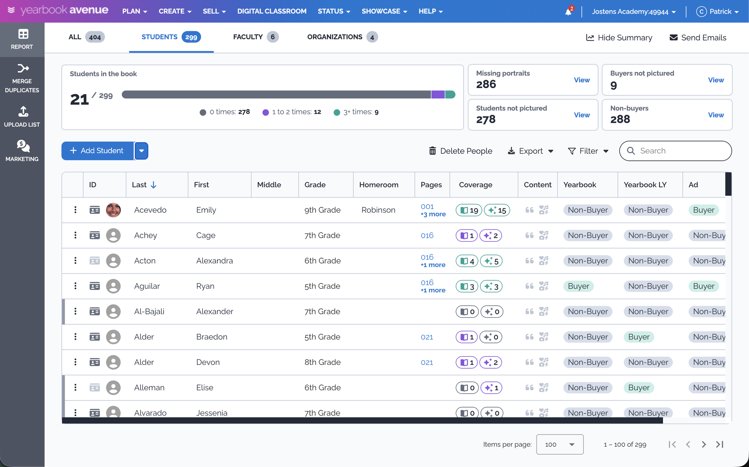
The new Coverage Report Experience.
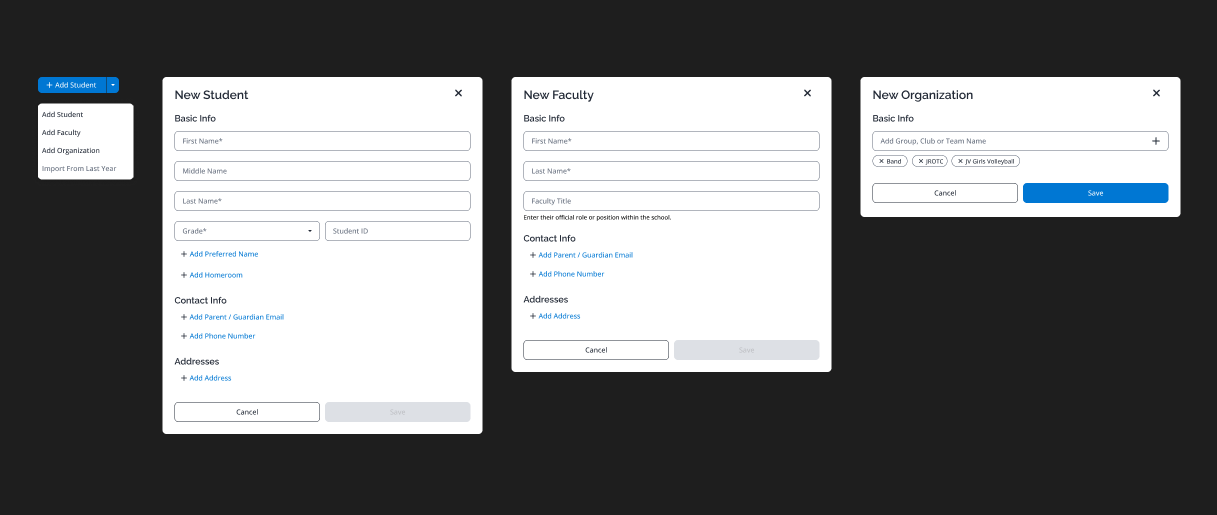
Custom forms with relevant fields to easily add new records.
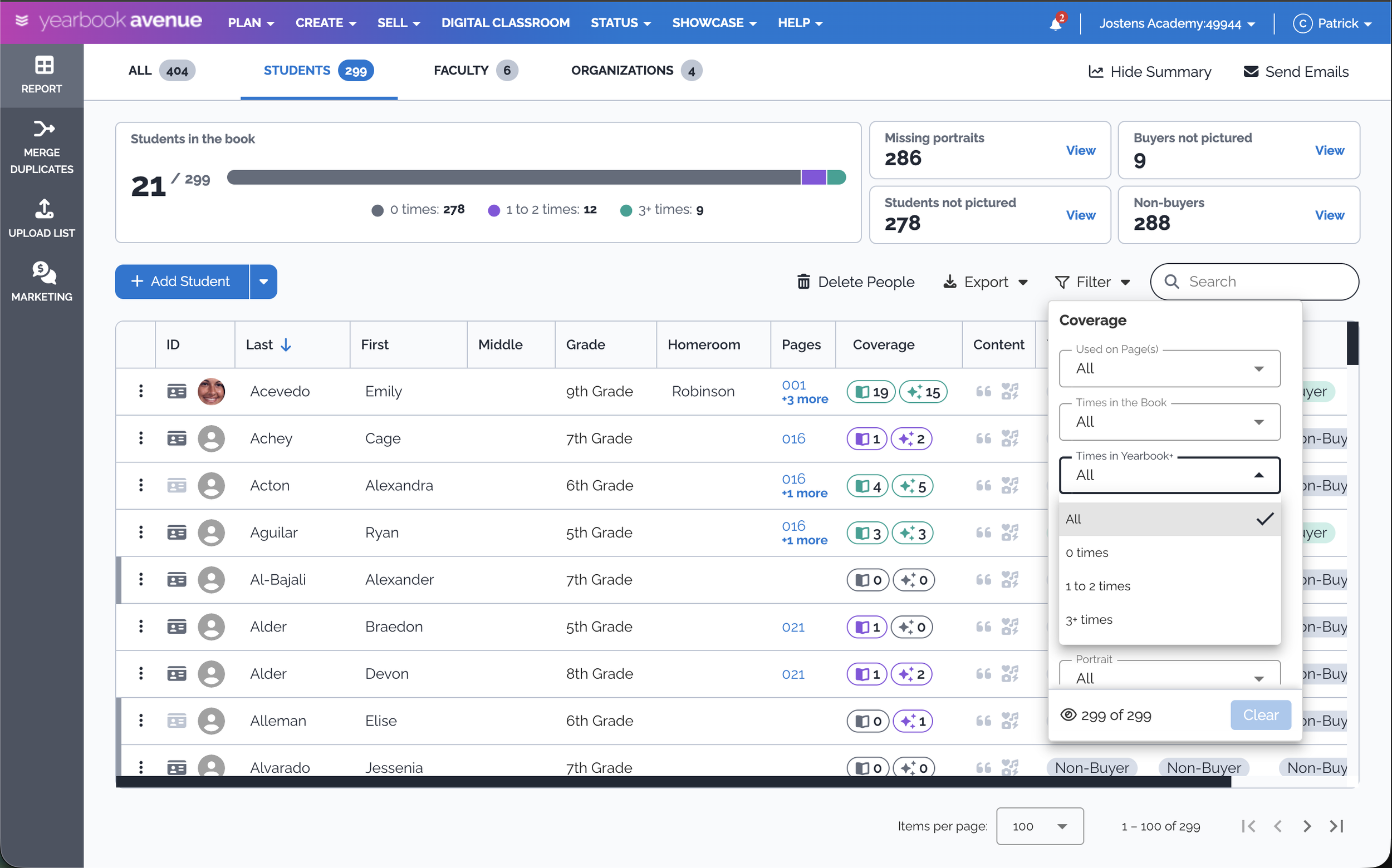
New filter experience made it easy to find under represented students.
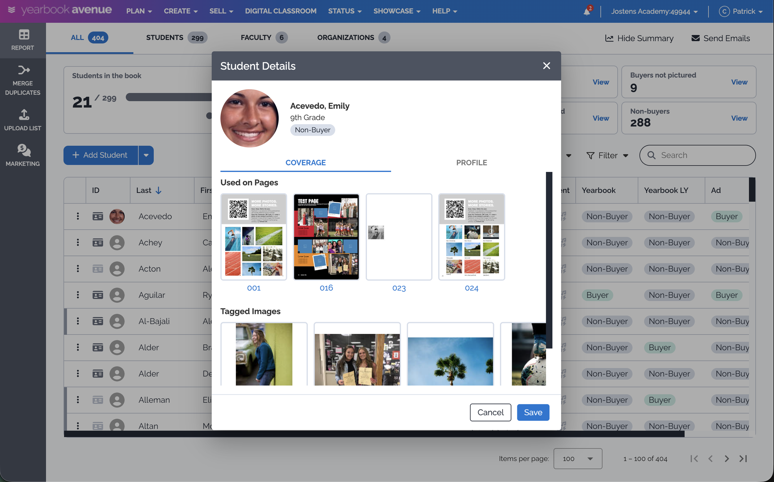
Explore any students’ details to see where they’re featured and tagged images.
THE HARD CALLS
Launch the better experience before every problem was solved.
Protect the foundation instead of rebuilding everything at once. Research exposed opportunities to improve student data, imports, and duplicate handling—but changing those systems together would dramatically expand the risk and scope. We chose to modernize the core experience while preserving critical underlying structures.
Define a pilot that was useful, not complete. We prioritized the new summary, redesigned report, record views, coverage across the book and Yearbook+, and new student information while deliberately deferring capabilities that weren’t ready.
Accept temporary inconsistency to start learning sooner. Rather than hold the redesign until the entire roadmap could launch together, we made those limitations explicit, supported users through the transition and used the pilot to determine what needed attention before broader rollout.
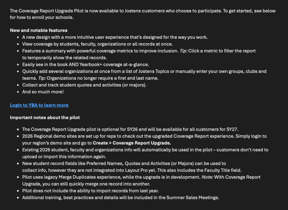
Rep communication introduced the new experience, highlighted what was ready to and set clear expectations for participation, scope, and what would come next.
FROM PLAN TO PRODUCT
Build, pilot the core.
Keep shipping.
Turn research into something buildable. I translated my findings into priorities, then partnered with our external designer to prototype and iterate on the experience using the new design system. From there, I worked with our engineering team to turn the designs into requirements, prioritize the backlog, work through implementation decisions, and test the experience before release.
Launch a focused pilot. I defined what needed to be ready to deliver meaningful customer value—and what could safely wait.
Turn feedback directly into the roadmap. After the pilot, I worked with the team to synthesize customer feedback, prioritize the highest-value changes, develop solutions, and validate them through testing while working towards the broader launch.
Keep improving after launch. Iteration continued through the summer while I also owned the product positioning, support content, and release communications needed to help customers understand the evolving experience.
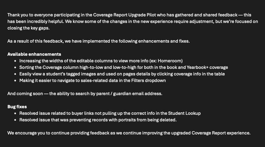
Feedback from real schools shaped the next round of enhancements, fixes, and follow-on work.
THE IMPACT AND EVOLUTION
A better report — and a foundation for what comes next.
Moved from pilot to production quickly. We opened up the pilot in February, launched two months later, then continued releasing improvements through the summer.
Expanded what “coverage” could mean. For the first time, staffs could see printed yearbook and Yearbook+ representation together, while new data fields began creating a richer picture of each student.
Built the foundation for smarter creation. The longer-term roadmap connects this richer student data across the yearbook workflow: centralized Do Not Use controls, stronger connections between students and their content, and recommendations that could surface quotes, activities or tagged photos when someone is still underrepresented.
Turned unfinished problems into the next roadmap. Duplicate records emerged as a deeper systems problem than a UI redesign alone could solve. We completed the new experience design and I synthesized recommendations for improving the underlying matching logic, but engineering work remains on the roadmap.
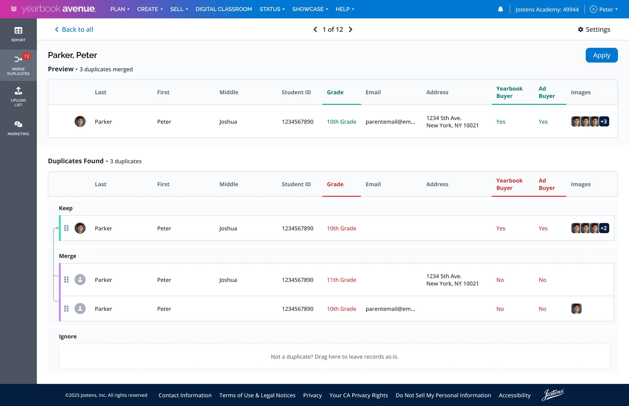
Prototype of the new duplicate merging experience.