DIGITAL CLASSROOM • JOSTENS
Transforming a content maze into a personalized learning platform.
Reimagined an aging resource library as a scalable learning experience—redesigning the UX, content architecture and CMS while orchestrating a phased migration of thousands of pieces of content.
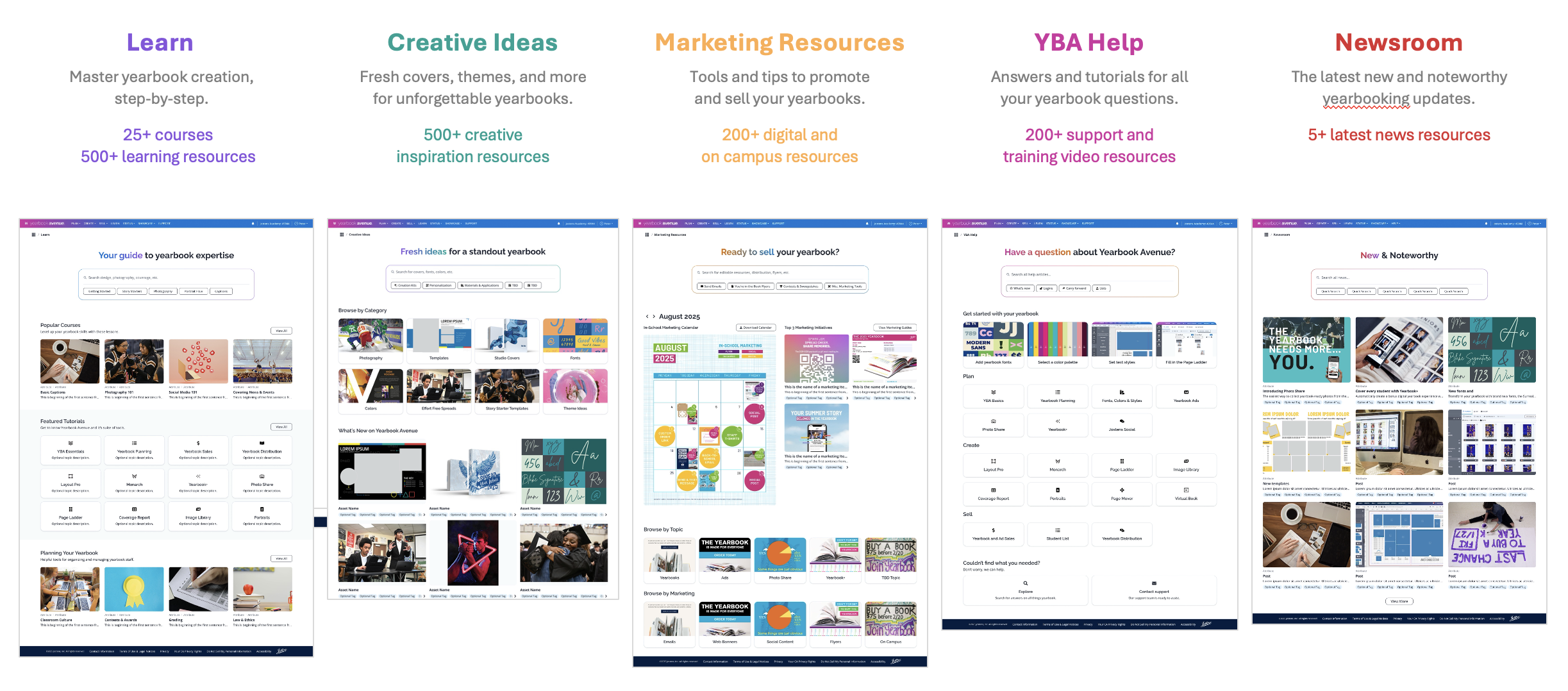
5 resource hubs launched
Role
Lead product manager • UX strategy
Product
Digital Classroom · B2B learning and resource platform within Yearbook Avenue
Stage
Experience redesign → Phased rollout
Timeline
Summer 2025 to Fall 2026 • Ongoing evolution
What I owned
Product strategy · UX direction · Information architecture · Requirements and prioritization · Content and migration strategy · Partner coordination · UAT and launch · Personalization roadmap
Team
Product and engineering • Sales, marketing and customer support • Operations and IT • External technology and design partners
THE CHALLENGE
A decade of content without a system.
Jostens’ learning platform had grown for a decade without product ownership. Known internally as the Digital Classroom, independent teams added curriculum, creative inspiration, marketing materials and support content with little coordination or shared structure.
Users had to know what they were looking for before they could find it. Weak navigation, limited search and inconsistent organization made discovery difficult and frustrating.
The platform was holding the experience back. The aging WordPress site lacked the structured content, reusable components and management flexibility needed to support better search, guided learning and future personalization.
I stepped in as the new product owner with a full reset to lead. That meant defining the product strategy, UX direction, CMS requirements, content model and delivery approach across design, development and content teams.
The timeline was fixed. Starting in summer 2025, we had to redesign and rebuild the experience while planning the migration of thousands of legacy resources, with the first major sections live by spring 2026.
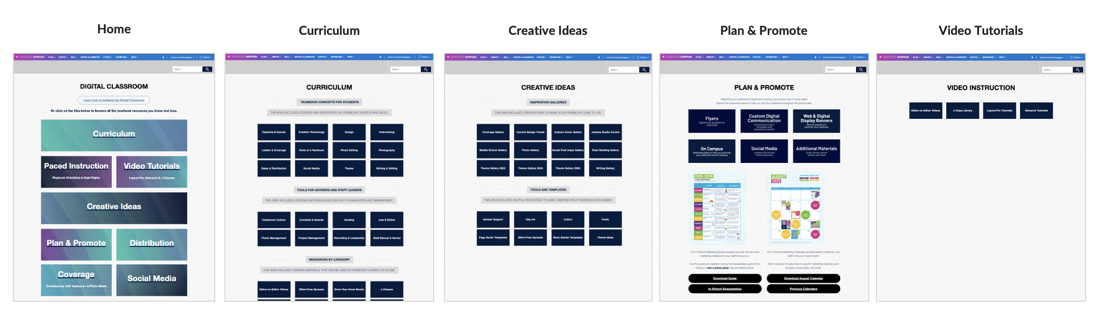
The Legacy Digital Classroom experience.
WHAT WE LEARNED
The content problem was bigger than the UI.
Years without governance had created redundant, outdated and trivial content. Auditing the platform revealed duplicated resources, aging information, buried assets and content that no longer deserved a place in the new experience.
Content migration couldn’t be a lift-and-shift. Existing pages had to be translated into a new information architecture, content types and learning model—sometimes consolidating several legacy resources into a single structured experience.
Four content teams needed four different migration plans. Each group had different resources, capacity and CMS experience, so I worked with their owners to audit, prioritize and sequence what could realistically move into each release rather than applying one process to everyone.
Better content required better governance. A more structured CMS needed defined admin roles, permissions, versioning and publishing controls so teams could manage their own areas without unintentionally changing someone else’s content.
Structure could become an advantage, not a constraint. Tagging content by topic, product and other unique, relevant attributes would make resources easier to search and filter today while creating the data foundation for a more relevant, personalized experiences later.
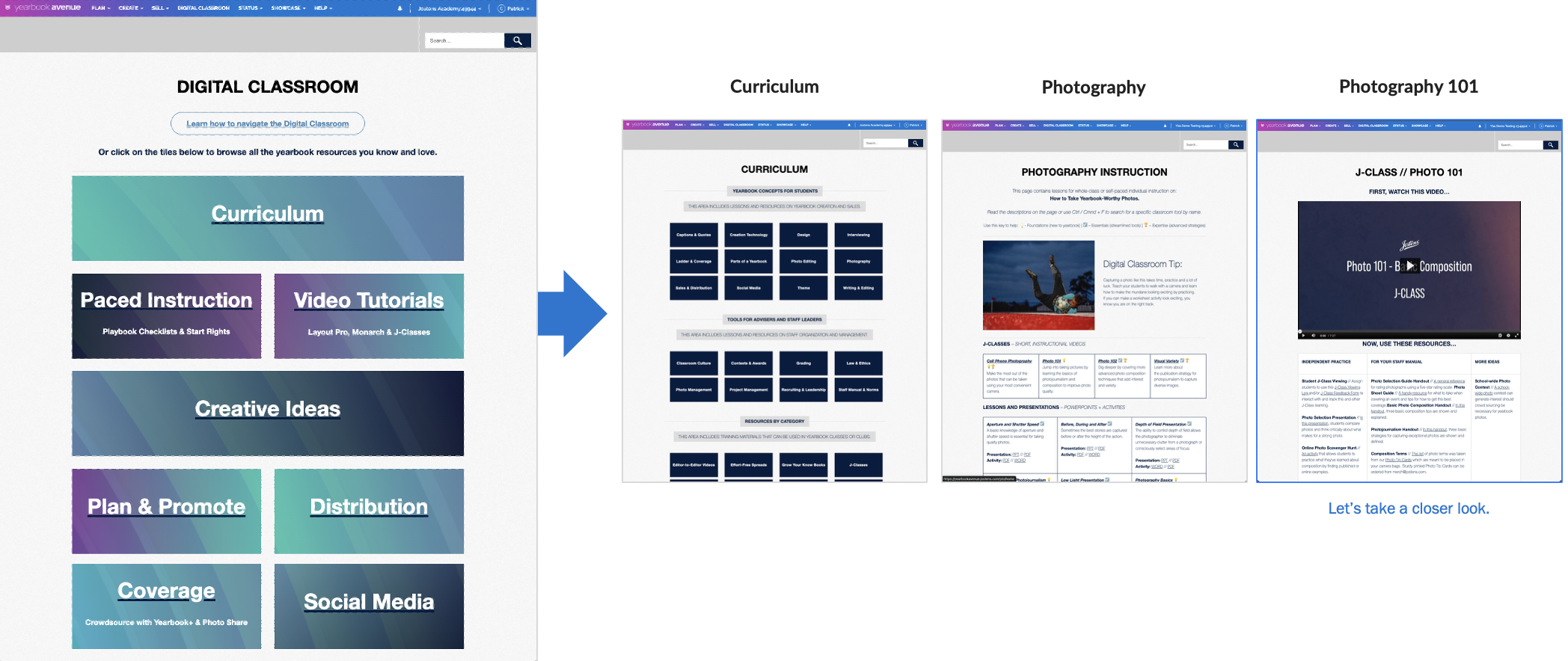
A choose-your-own-adventure experience made learning content harder to find and follow.
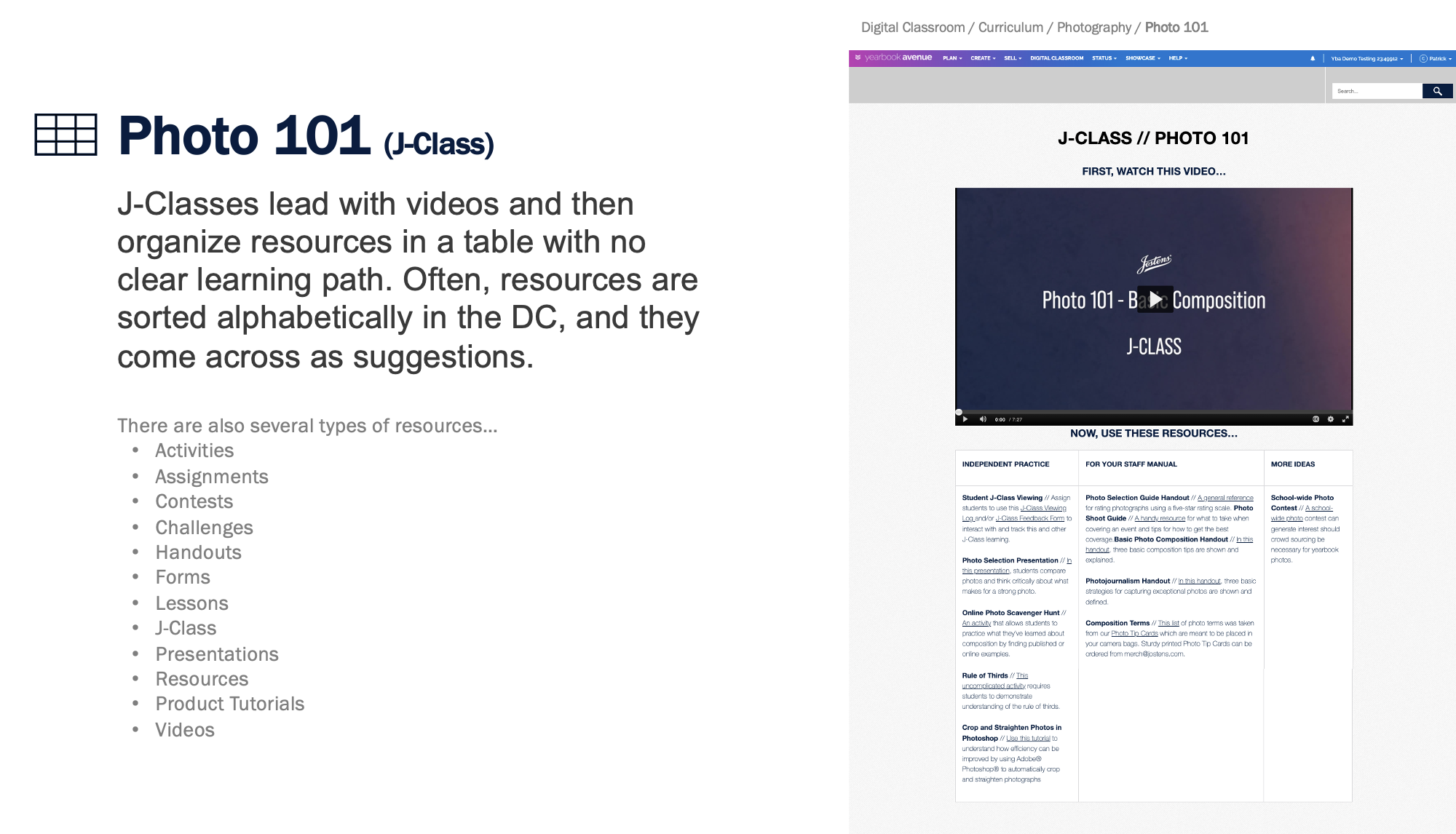
Fragmented resources and weak hierarchy made it difficult to understand what to do next.
THE STRATEGY
Build the system first. Personalize it next.
Treat the redesign as a platform transformation, not a website refresh. We defined a scalable Drupal CMS foundation built around reusable components, structured content types, tagging, permissions, accessibility and search—so teams could manage richer experiences without relying on developers for every change.
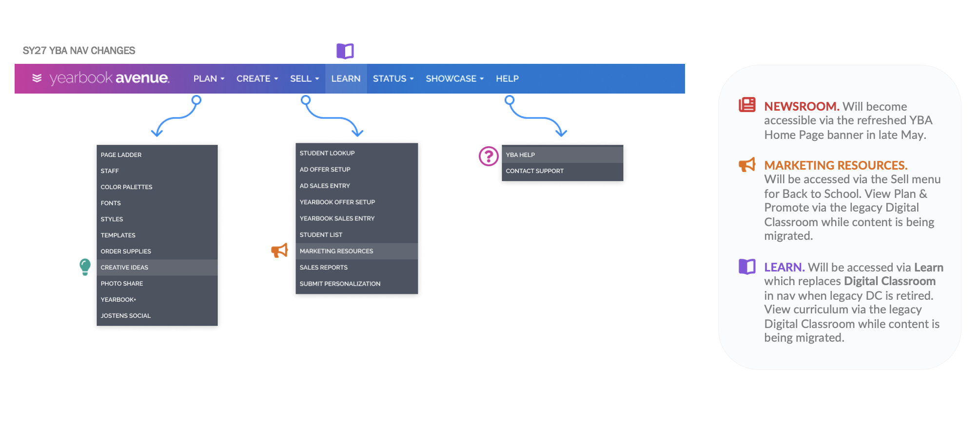
Replace accumulated navigation with clear destinations. We reorganized the experience around five purpose-built hubs—Learn, Creative Ideas, Marketing Resources, YBA Help and Newsroom—giving each type of content a clear home while connecting the entire platform through search and navigation.
Turn learning resources into learning paths. Instead of collections of loosely related files, we adopted an LMS-style model of courses, modules and coursework that could guide advisers and students step-by-step while still allowing content to be reused and recombined.
Design the content model for where the product was going next. Metadata such as role, skill level, product, topic, school profile and more would improve discovery immediately while creating the foundation for segmenting and eventually personalizing content recommendations.
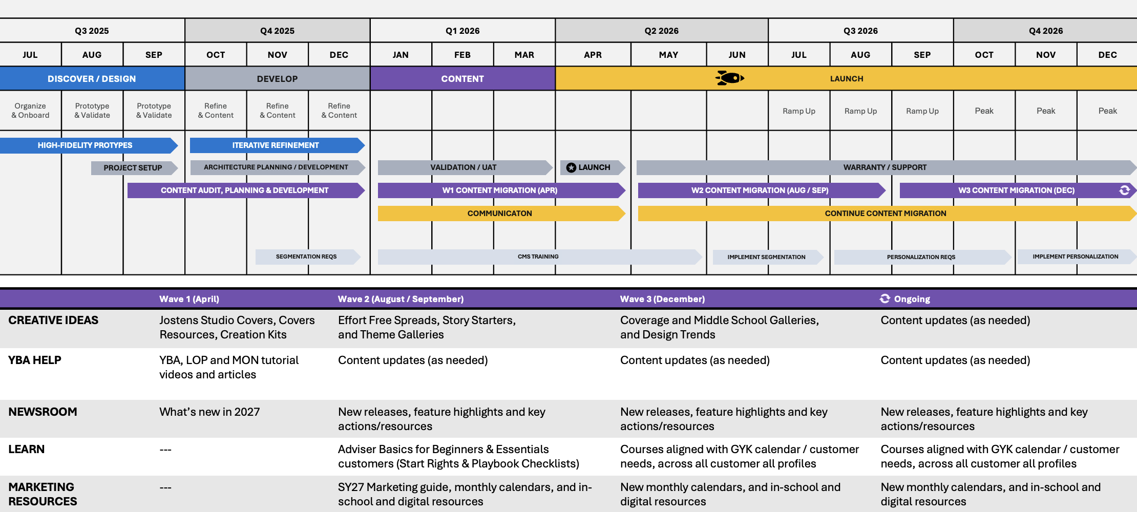
Launch progressively instead of waiting for every page. We prioritized the most valuable content into migration waves, allowing new and legacy experiences to coexist while we launched usable sections, validated them and continued moving the remaining content and resources over time.
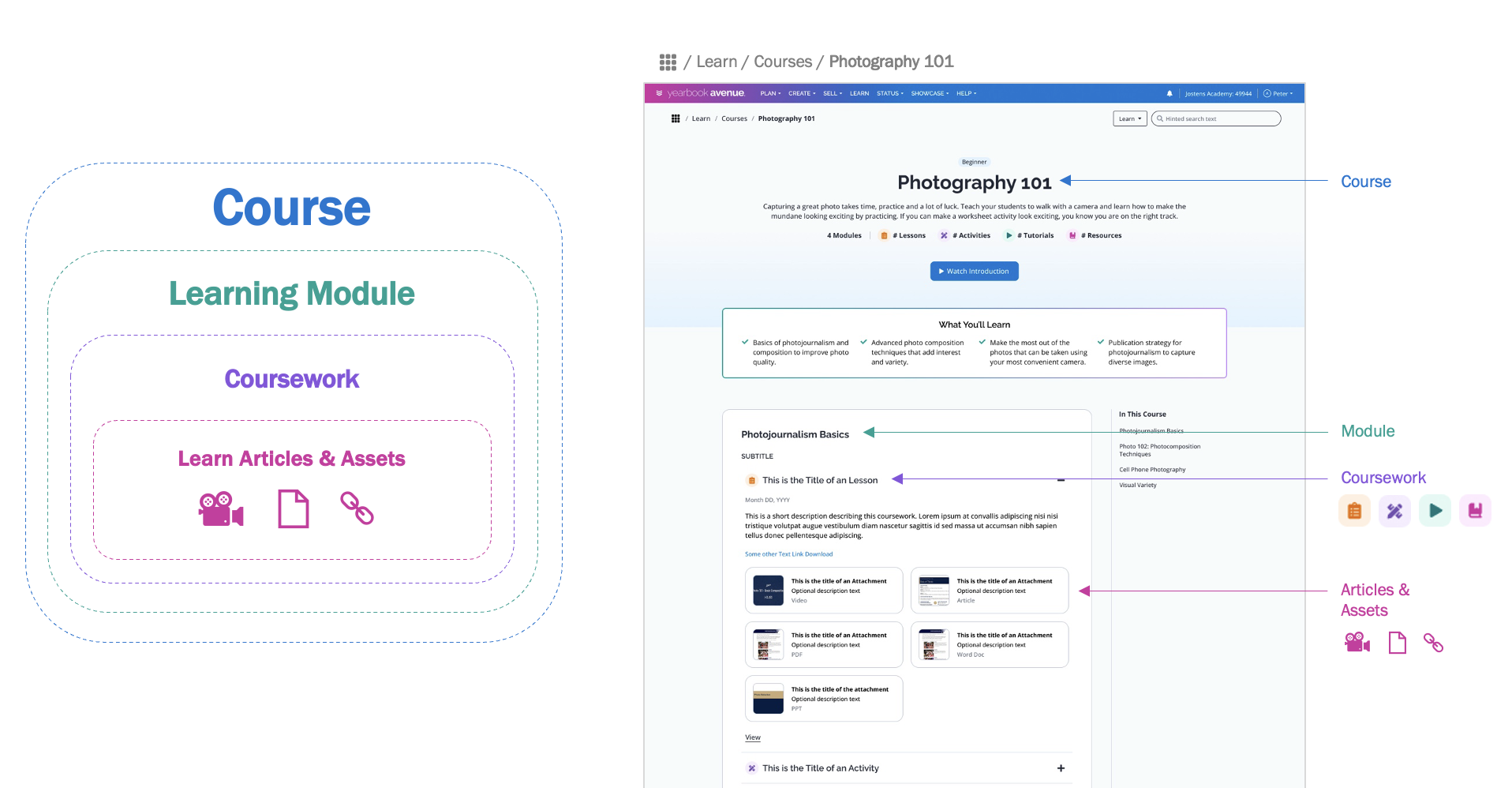
Mapping of content into a clear learning model.
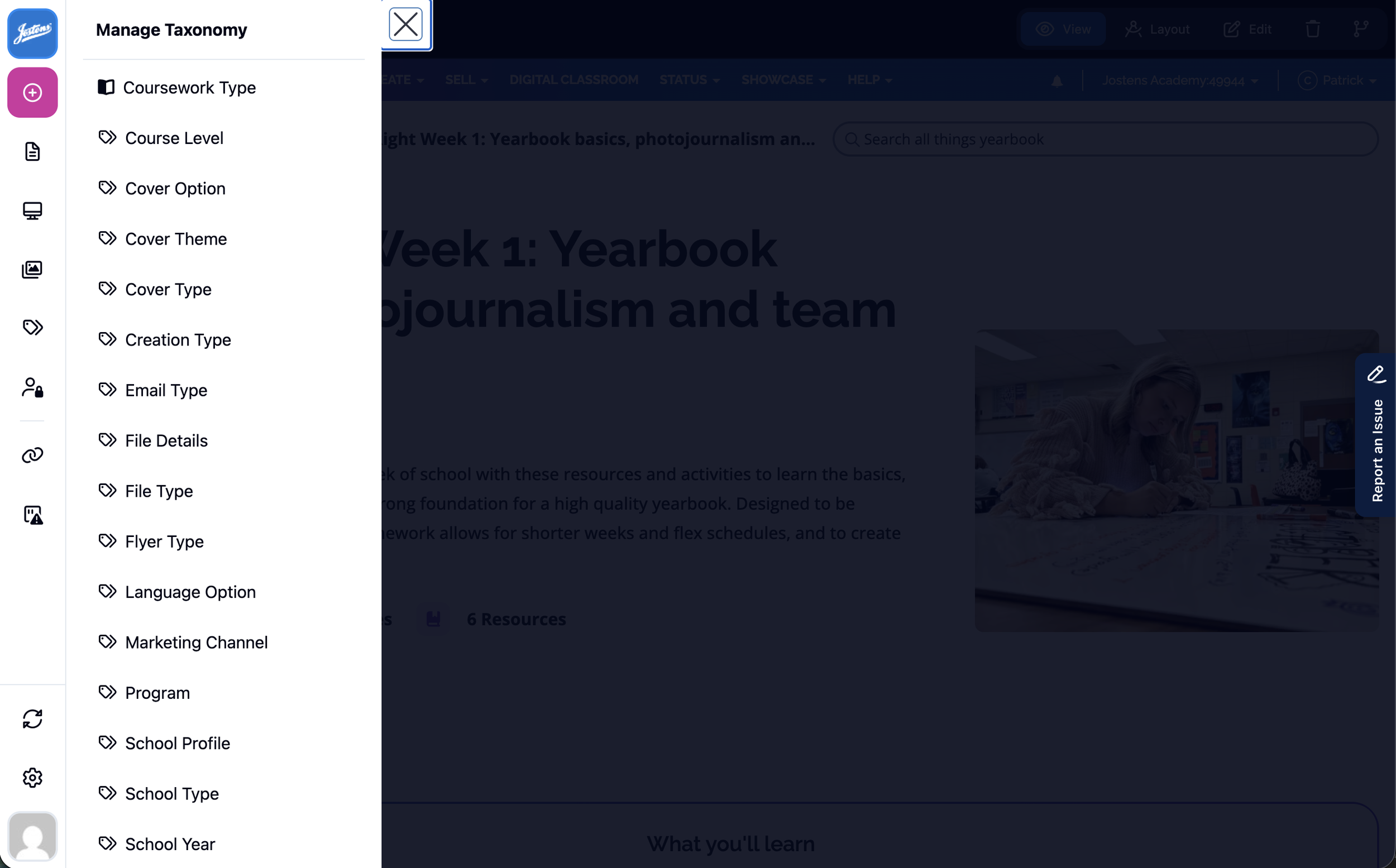
Sample of the defined tagging options in the new CMS to improve search in short term and enable personalization later.
THE EXPERIENCE
Design once.
Scale everywhere.
We extended the new Yearbook Avenue design system into an entirely new product experience. Working with the same product designer, we created new page templates and UI patterns that felt native to Yearbook Avenue while giving five very different content hubs a consistent visual language.
Every design decision had to work twice: for the user and the content creator. We translated the Figma components into a library of configurable CMS components—heroes, cards, grids, accordions, media, CTAs and more—so teams could build varied pages without sacrificing consistency.
Structure replaced one-off page design. Common templates, components and content models established predictable patterns across the five hubs, while structured navigation and search made it easier for users to move between them.
The product expanded the design system as we built it. The Digital Classroom introduced content-heavy patterns the original design system hadn’t needed, giving us an opportunity to add new reusable components and standards.
Consistency didn’t mean sameness. The system gave each hub enough flexibility to serve its specific purpose—from structured courses and learning paths to visual inspiration galleries and support articles—while still behaving like one connected experience.
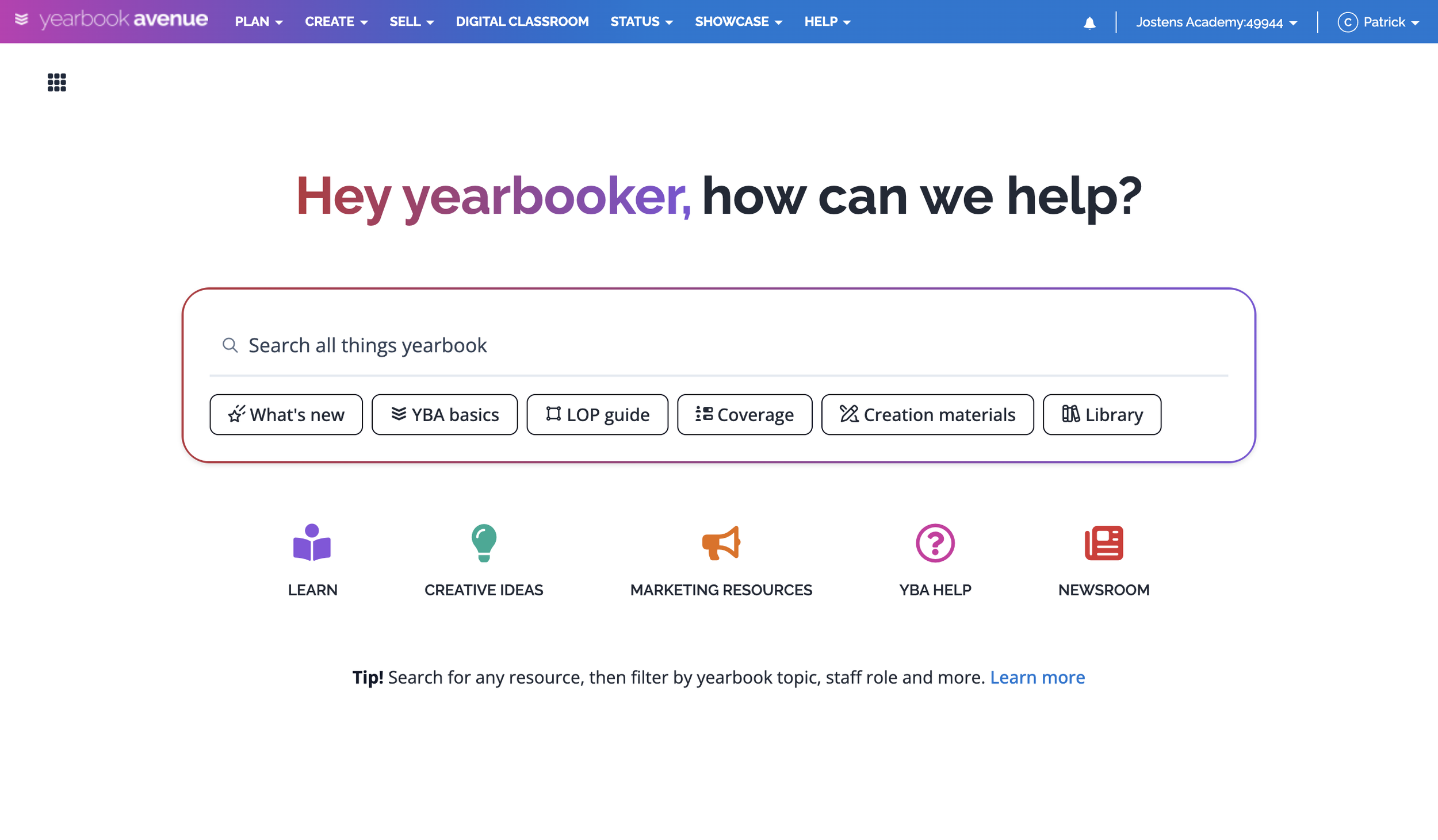
With content better structured and tagged, the homepage could confidently lead with search and five clear destinations that encouraged users to explore.
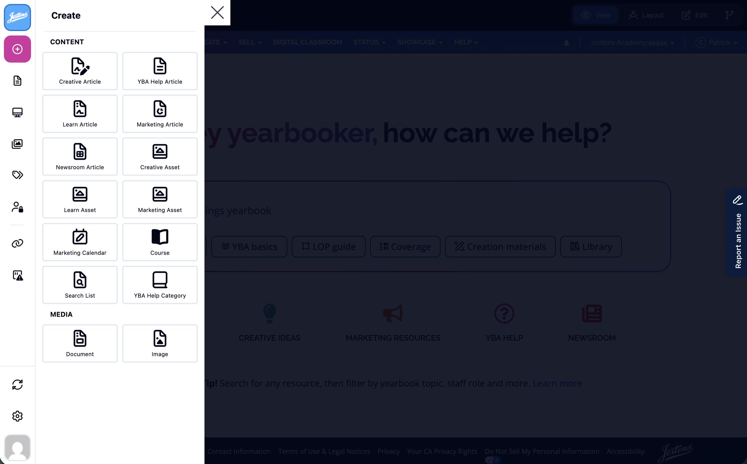
The new CMS gave content managers structured page templates.
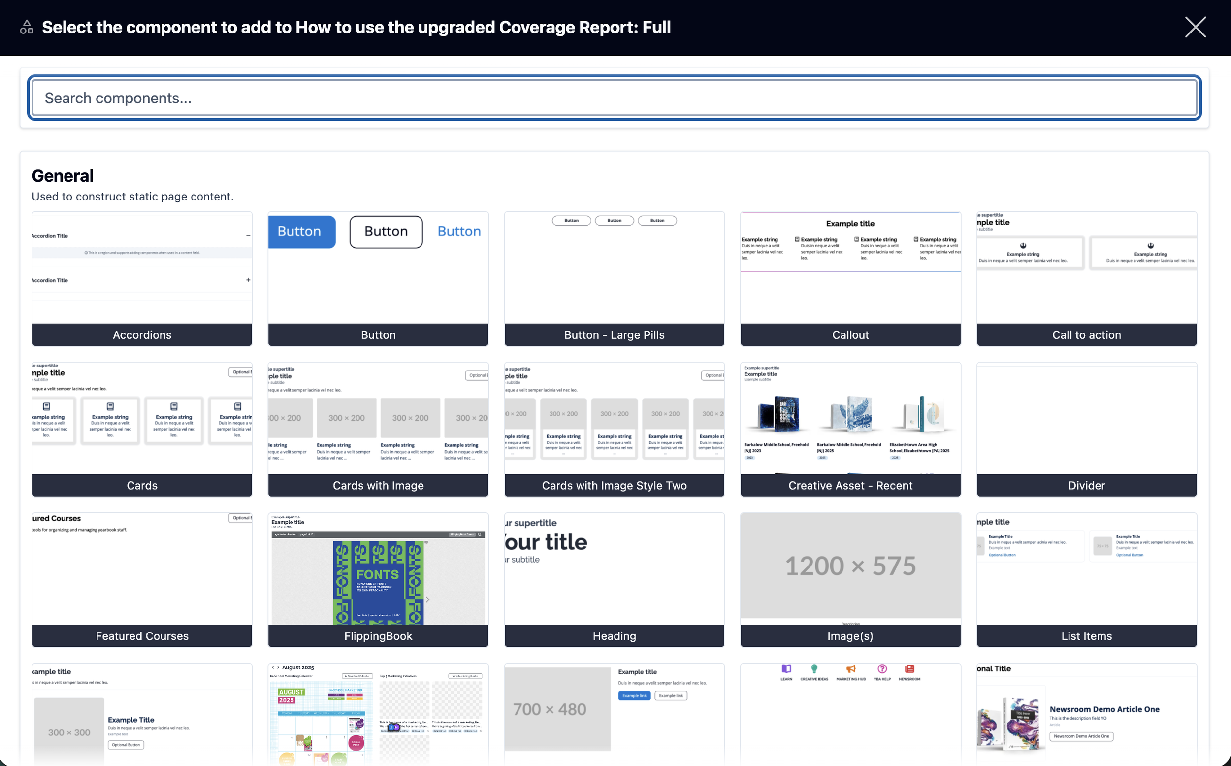
The new CMS also included a library of configurable components so teams could build pages without sacrificing consistency.
THE HARD CALLS
Launch what mattered.
Keep the rest moving.
We couldn’t launch everything at once. With a fixed spring deadline, limited content capacity and an external development partner still learning our business and integrations, I prioritized which hubs and which content within them had to be ready first—then organized everything else into migration waves.
I chose to be first through the new system. As both product and content owner for all product support content, I validated the CMS, refined workflows and established migration patterns before training my team to restructure and move hundreds of support pages.
We shifted people to where the launch needed them most. Alongside our normal workload, my team supported other teams by helping them migrate hundreds of pages and assets to keep the launch on schedule.
Priority mattered more than completeness. Content audits helped determine what should move first, what needed updating or consolidating, and what didn’t need to migrate at all.
We were also moving the customer’s cheese. Familiar destinations were being repositioned as Learn, Marketing Resources and YBA Help, so old and new experiences had to coexist during migration while we taught customers the new model.
FROM PLAN TO PRODUCT
Turning the strategy into a live platform.
I translated the vision into an executable plan. Working across product, design, IT and an external development partner, I turned the new experience into requirements, reusable CMS components, integrations and a development scope that could be estimated, prioritized and delivered on time.
Design and development moved together. As the designer completed new templates and extended the design system, I worked with our development partner to translate into configurable Drupal components and structured content types—refining requirements as technical constraints and opportunities emerged.
I connected an external build team to the internal ecosystem. That meant helping them understand the business and coordinating with Jostens IT on authentication, hosting, APIs, deployment and other integrations.
Content migration became a parallel delivery track. Once the CMS was ready, I trained internal teams and coordinated the content migration with a project plan intentionally designed to overlap CMS training, UAT, launch and multiple waves of content migration.
We launched incrementally and kept building. Priority experiences went live first, additional hubs followed as content became ready—allowing customers to benefit from the new platform without waiting for thousands of legacy resources to be completely rebuilt.
THE IMPACT AND EVOLUTION
Launched early.
Built for what comes next.
All five resource hubs are now live, with key releases beating their original targets. Marketing Resources and Learn both launched months ahead of their original targets.
The phased strategy kept progress moving after launch. Customers gained access to the new experience without waiting for every legacy resource to be rebuilt, while teams continue auditing, restructuring and migrating more content throughout the year.
The design system compounded in value. This project extended the design system with new content-heavy patterns and reusable components—showing it could scale across different products and delivery teams.
Structured content created the foundation for personalization. The new taxonomy already organizes resources by dimensions such as product, role, skill level, topic and more, giving us the data structure required to move beyond a one-size-fits-all experience.
The next phase is already taking shape. I’m now helping define the scope and business requirements for segmentation and personalized recommendations—using available customer attributes in Salesforce to surface increasingly relevant content.