YEARBOOK AVENUE DESIGN SYSTEM • JOSTENS
Turning an accessibility mandate into a design foundation built to scale.
Delivered a three-month accessibility modernization while building a design system that scaled across products and teams.
Thousands of schools supported by a more accessible, consistent experience
Role
Lead product manager • UX strategy
Product
Yearbook Avenue · B2B yearbook creation platform and supporting design system
Stage
Accessibility modernization → Design system launch → Continued expansion
Timeline
Spring to Summer 2025 • Ongoing evolution
What I owned
Accessibility priorities • Product requirements • UX direction • Component strategy • Design system adoption • Delivery coordination • UAT and launch
Team
Product and engineering • Sales, marketing and customer support • Operations and IT • External design partner
THE CHALLENGE
Accessibility had become a condition of doing business.
The problem: School districts across multiple states were beginning to require proof that Yearbook Avenue met WCAG 2.0 Level AA requirements before signing or renewing contracts—but the work extended across a sprawling suite of interconnected tools and experiences, exposing the absence of a shared design foundation.
What was at risk: Several districts could refuse to sign contracts unless we demonstrated that Yearbook Avenue met their accessibility requirements.
What made it hard: Buttons, cards, colors, typography, labels, navigation patterns, component states, and other interface elements had to be evaluated, updated, and standardized. Historically, our product team used Adobe XD, but there was no shared component library, standardized workflow, or common design language as the team began exploring a move to Figma.
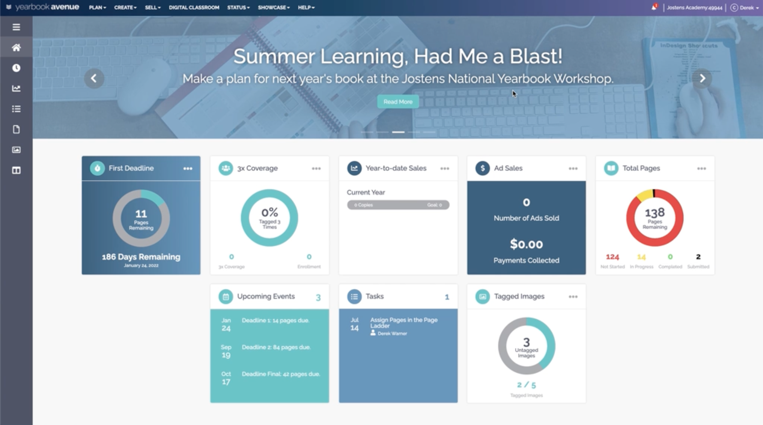
Yearbook Avenue home page before accessibility updates.
WHAT WE LEARNED
The accessibility gaps were symptoms of a fragmented design system.
Years of development had created multiple visual languages. Yearbook Avenue relied on numerous style sheets, while newer products had introduced patterns that were similar—but not fully consistent—with the legacy experience.
The same components needed different implementations. Tabs, accordions, buttons, icons, status indicators, and other patterns sometimes required distinct variables or technical approaches depending on the product and underlying technology.
Basic design decisions had never been fully standardized. The team lacked shared guidance for component hierarchy, primary and secondary actions, icon usage, interaction states, typography, colors, and status messaging.
Accessibility created an opportunity customers could see. While many WCAG improvements would operate behind the scenes, standardizing the system also allowed us to visibly refresh the platform to feel more modern, consistent, and intentional.
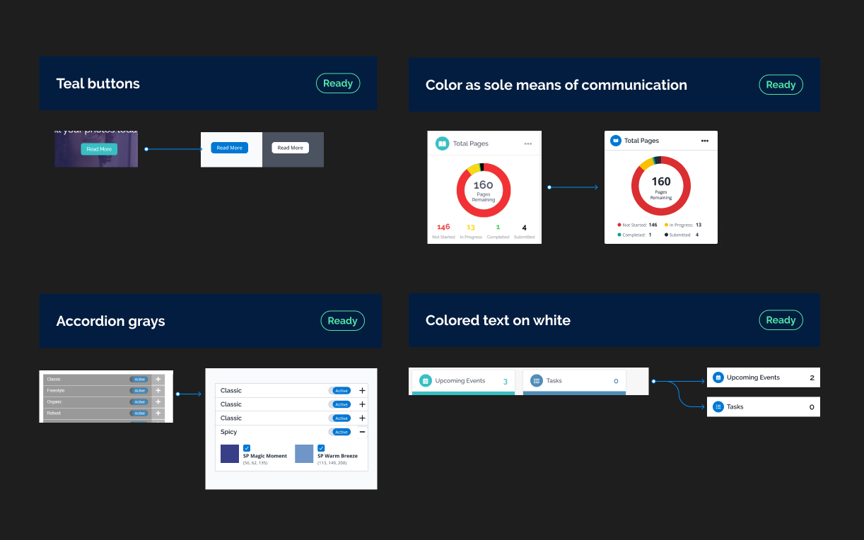
Snapshot of initial approaches for a handful of components.
THE STRATEGY
Fix the foundation first, then use data to close the biggest gaps.
Start with the accessibility baseline. We used recurring accessibility reports to understand where the platform was falling short, identify the highest-priority issues, and measure progress toward the required compliance threshold.
Standardize the fundamentals before individual components. We revisited color, typography, states, and other foundational design decisions first—including accessible variations for components used across both light and dark product experiences.
Design for the realities of a complex platform. Components needed enough flexibility to work across different applications, backgrounds, and generations of technology without creating a separate solution for every screen.
Prioritize for maximum impact under a tight deadline. We addressed the issues most likely to improve the accessibility score quickly, resubmitted the experience for evaluation, and used the results to continuously reprioritize while lower-priority improvements continued afterward.
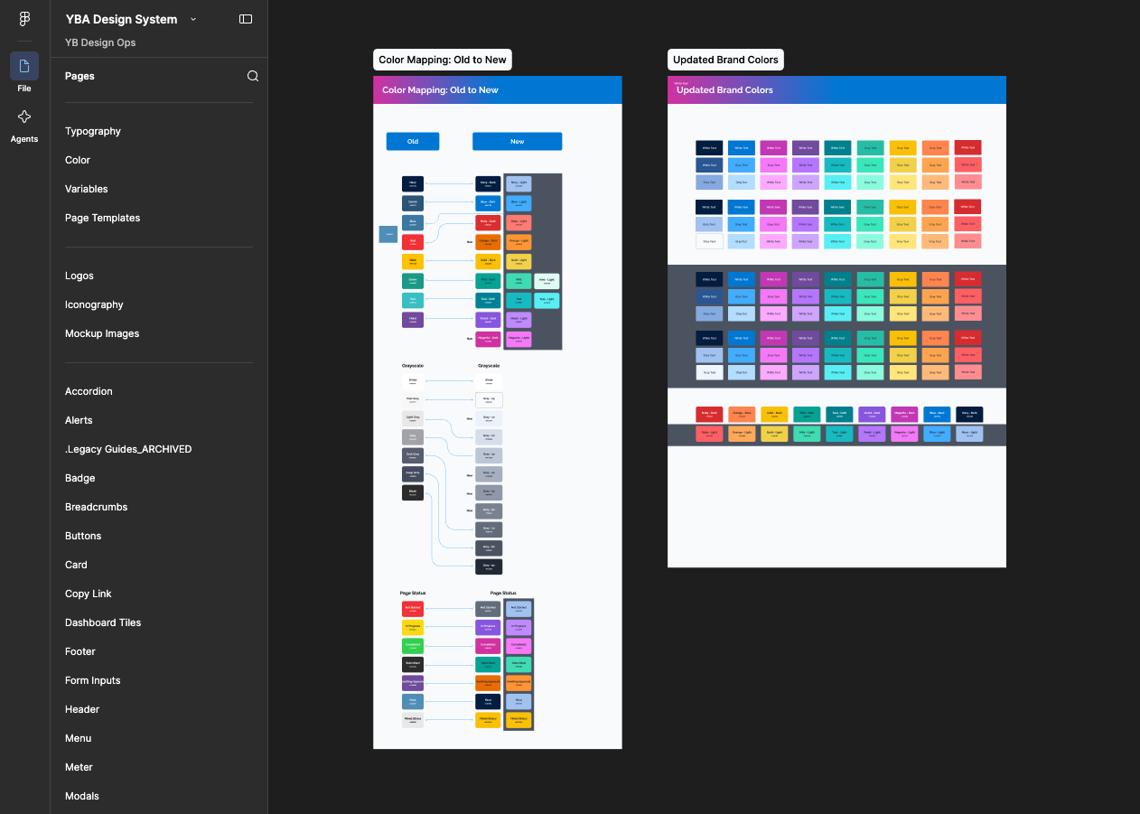
Started with a foundation of new, accessible brand colors and mappings for handoff to engineering.
THE EXPERIENCE
Make accessibility improvements visible, not just technically correct.
Refresh the parts of the product users touched every day. We updated high-visibility elements such as the main navigation, buttons, colors, and other common UI so the accessibility work also felt like a meaningful product improvement.
Build the visual system around accessible foundations. We established core colors, typography, states, and component treatments that could meet accessibility requirements while creating a more consistent visual language across the platform.
Design for different contexts without losing consistency. Light and dark product areas required variations of colors, states, and components, so the system was built with the flexibility to work across different backgrounds while still feeling like one product.
Turn invisible improvements into a visible refresh. Many changes—such as screen-reader support, keyboard navigation, and structural updates—would not be obvious to most users. Pairing them with noticeable visual improvements helped communicate the platform itself was being modernized.
Before: Yearbook Avenue home page at beginning of the school year.
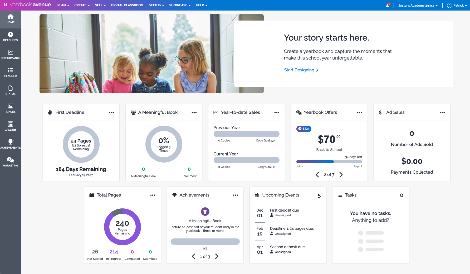
After: Refreshed with high-visibility updates to elements like the main navigation, buttons, colors, and other common UI.
THE HARD CALLS
Changing the UI meant changing the system around it.
Replace a familiar brand color across the ecosystem. Teal was the primary emphasis and call-to-action color, but it could not consistently meet accessibility requirements. Moving to the higher-contrast primary blue meant changing a deeply embedded visual pattern across the product.
Accept the ripple effect beyond the UI. A color or component change did not stop with Yearbook Avenue. Screenshots, help content, sales materials, training resources, learning content, and other customer-facing assets also needed to evolve.
Make broad changes without having a perfectly standardized platform. Multiple style sheets, legacy areas and newer products meant we could not rely on a single global update. We inspected key screens and products individually, implemented the highest-impact changes, then continued correcting inconsistencies as we found them.
Change how the team designed while changing the product itself. At the same time we were delivering the accessibility work, the product team was moving toward Figma and a shared component system. That meant learning a new workflow, adopting new standards, and changing established habits while still meeting a fixed deadline.
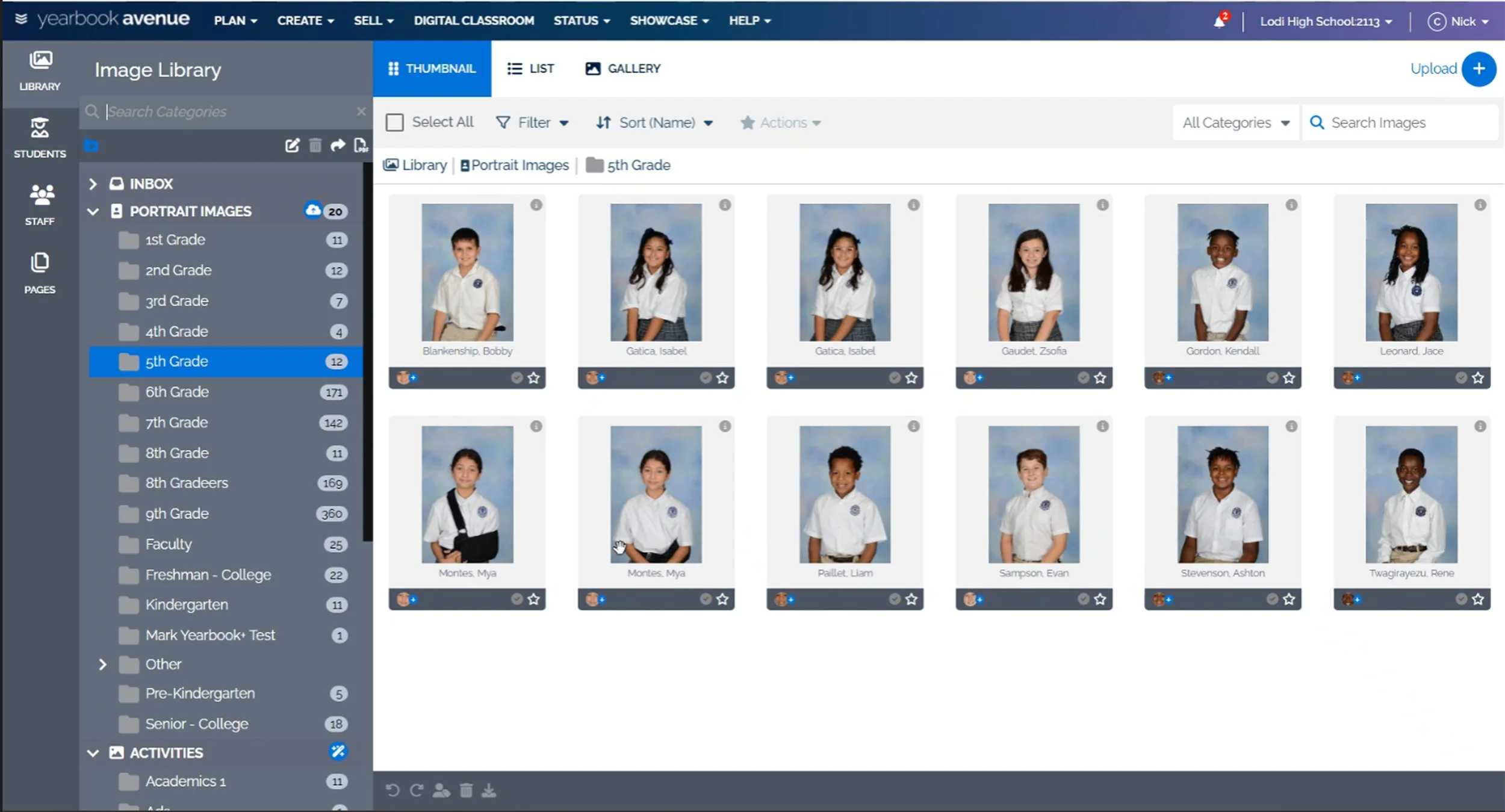
Example of iteratively testing various products with primary color changes across light and dark backgrounds to see where improvement was needed.
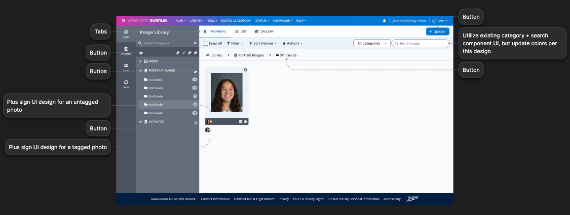
Used Figma annotations to provide direction on mapping existing UI patterns to the new components that would replace them.
FROM PLAN TO PRODUCT
Build the system while putting it to work.
Partner closely across product and design. I served as the internal product partner to a product design contractor with deep knowledge of both Jostens and Figma. Together, we translated the accessibility requirements and product needs into a shared design system.
Turn standards into reusable product decisions. We worked through colors, typography, states, components, and variables while accounting for different style sheets and generations of technology to light and dark product experiences.
Bring product and engineering into the same system. As components and patterns were defined in Figma, I helped connect them back to actual workflows, requirements, priorities, and implementation needs—giving product managers a common way to prototype and engineering a more consistent design language to build from.
Ship, measure, and keep improving. Rather than waiting for the entire design system to be complete, we applied the new standards to the highest-priority accessibility issues, released updates incrementally, resubmitted Yearbook Avenue for scoring, and continued refining the system as we worked toward the required threshold—all within a three-month delivery window.
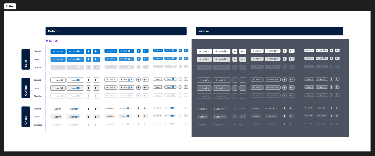
A new button component standardized color, states, and light/dark variants.
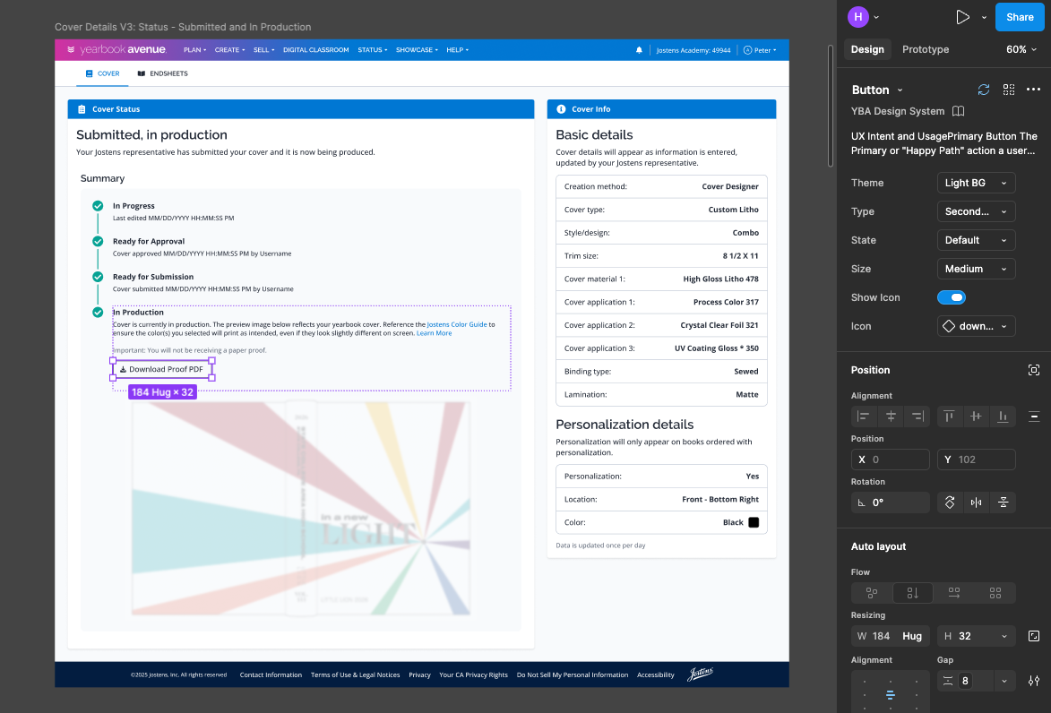
Example of design system and new button component leveraged in Cover Status page redesign, accessibility updates.
THE IMPACT AND EVOLUTION
A compliance project became a design foundation for the business.
Protected customer relationships and secured business. The accessibility work gave school districts the confidence and documentation needed to move forward with contracts contingent on meeting accessibility requirements.
Turned accessibility work into documented conformance. The project resulted in a VPAT for Yearbook Avenue, providing a formal record of accessibility support and helping demonstrate alignment with the standards states and school districts are increasingly requiring.
Created a reusable system that kept growing. What began as a three-month accessibility initiative evolved into a design system with 270+ components spanning typography, colors, iconography, states, variables, and reusable UI patterns.
Changed how future products were designed. The shared Figma system made prototyping faster and more consistent across projects—whether the work was being delivered with external design partners or internal engineering teams.
Scaled beyond Yearbook Avenue. The system became a launching point for new design systems and shared practices across the broader Jostens ecosystem and helped create a common design language that could be used by other product teams, business units, and external partners.
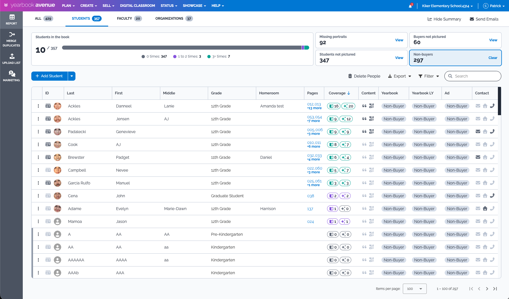
The design system accelerated prototyping of new experiences.
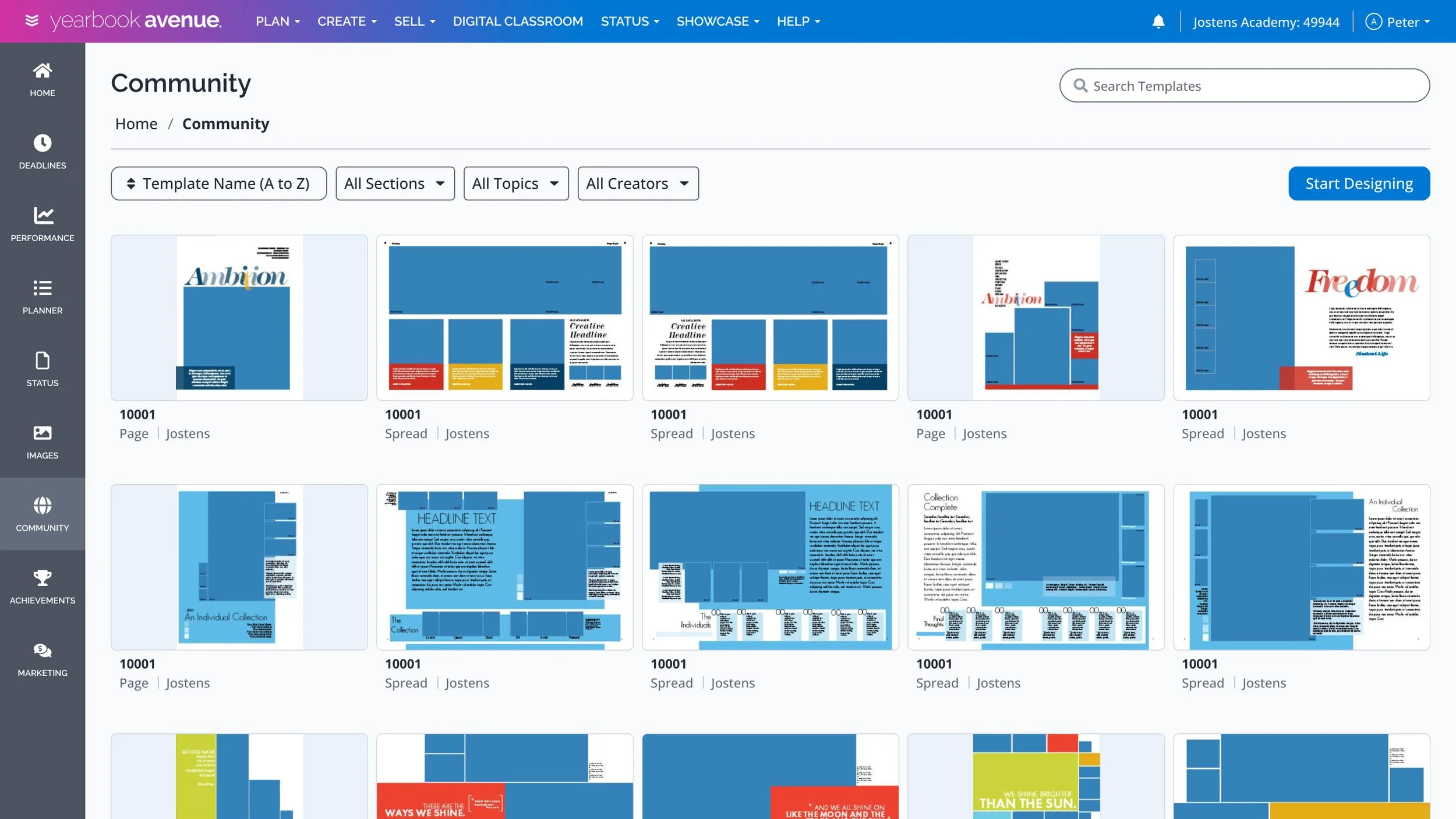
Reusable components and UI patterns reduced decision-making.
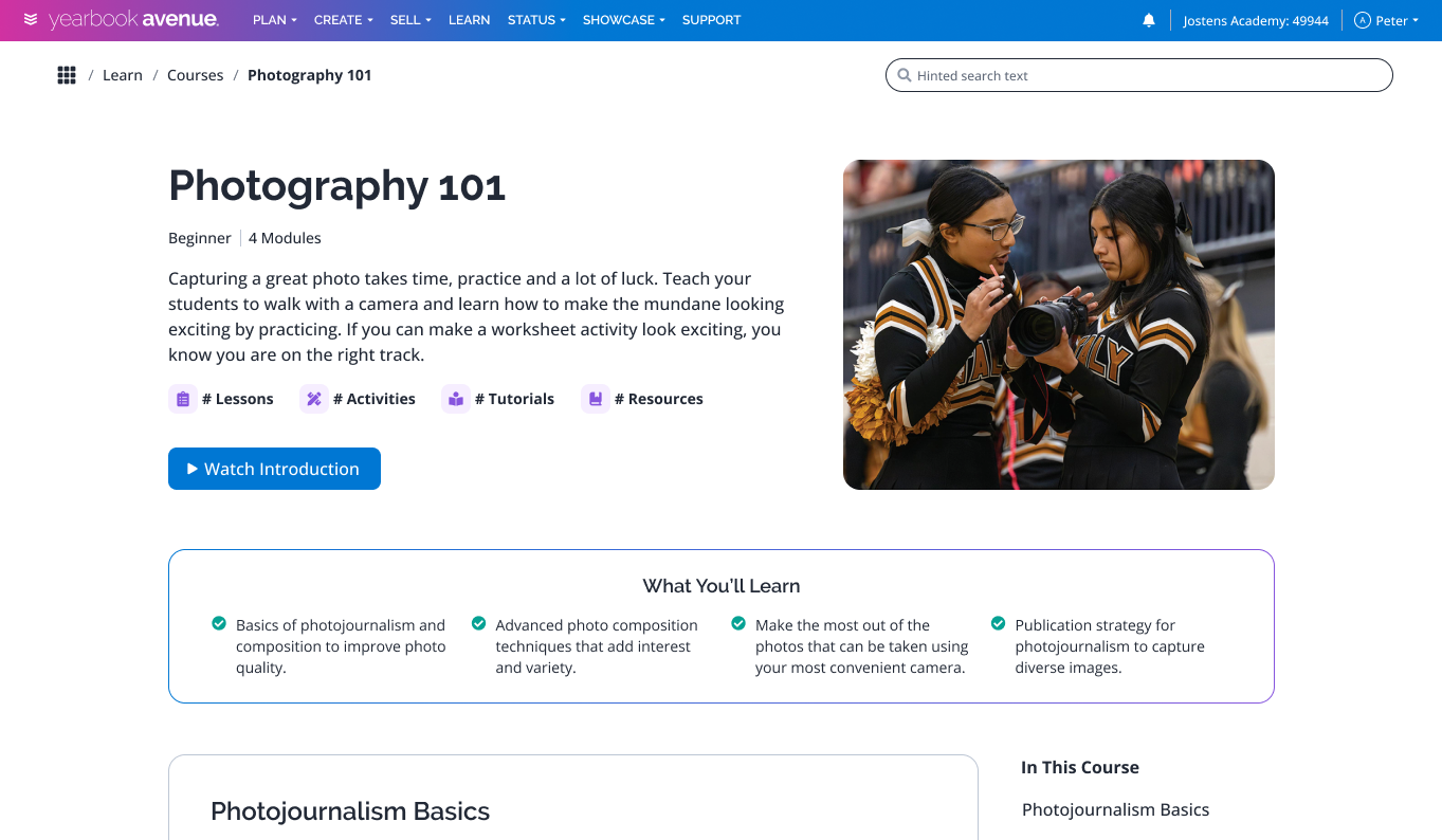
The design system was able to flex and accommodate different product types.